Improved Aculab Cloud documentation and a new console
We’ve been busy in the background recently at Aculab with a major website refresh. Aculab has evolved over decades (40 years this year!) from a vendor supplying hardware to a much more software-centric product company. We still sell telecom gateways extensively, but nowadays the bulk of our enabling technology business is software, and in particular our communications platform-as-a-service (CPaaS) product, Aculab Cloud.
The Aculab Cloud portal had grown since its inception in 2011, and as usual with something that grows over time, not everything was organised in the best possible way. We found that product documentation could be found in many places, and a rationalisation was needed. We’ve now completed that rationalisation task, we hope you like the results.
The new Aculab Cloud documentation structure
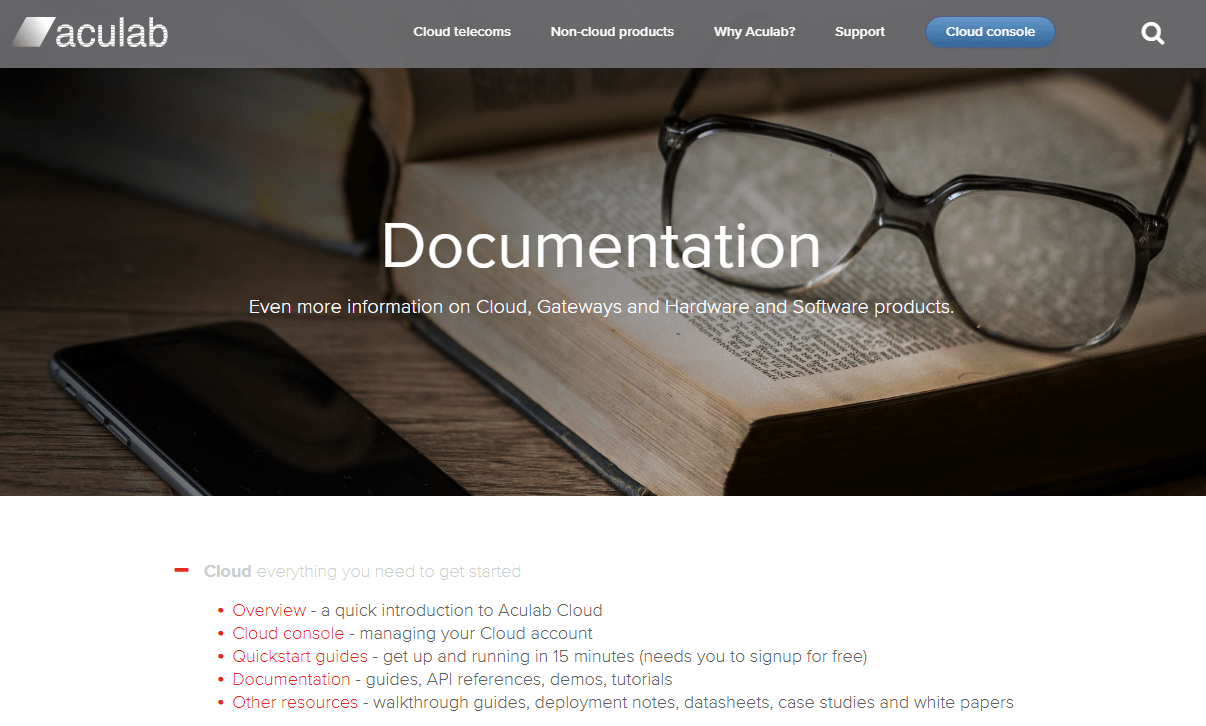
We have organised the Aculab Cloud documentation into one place, under https://www.aculab.com/documentation. From there, you should be able to find everything you need from white papers describing cloud software in healthcare markets through to product overviews and detailed API guides.

We’ve added an overview section if you are new to Aculab Cloud and want an introduction to its concepts and capabilities. We then have the core documentation area (described below), and finally a list of downloadable pdf resources, some held behind a sign-up form but the majority free to download, such as whitepapers, case studies and deployment notes.
The core documentation
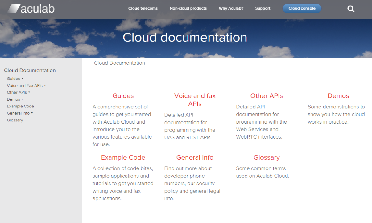
The main documentation section covers the API documentation, demos, example code and general information. We have taken on board user feedback and made this area much more extensive, and simpler to navigate. The intention is that you can start at a higher level and dig deeper into the APIs as required.
Improved management console
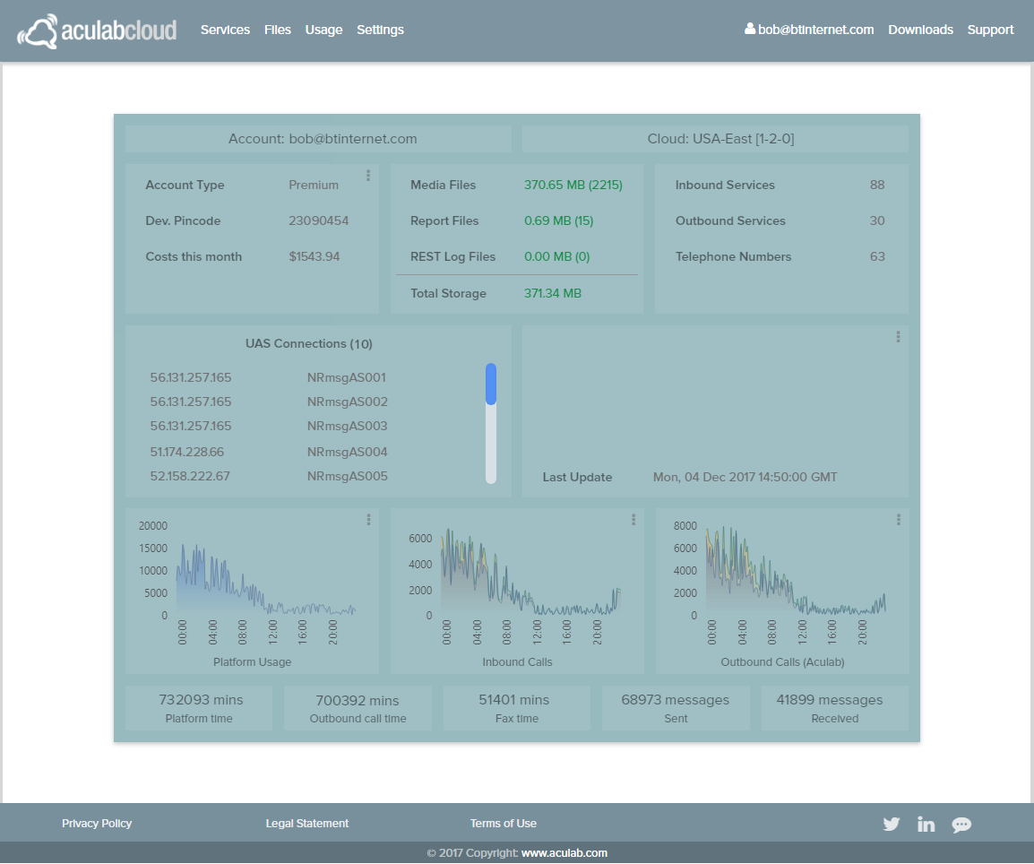
We’ve also taken the opportunity to bring the Cloud console into line with the main website style, and to integrate it fully into the structure of the main Aculab website. The console now has a dashboard view, a new look and improved layout/menu structure. The dashboard (screenshot below) brings together useful information about your account onto one page, and can give you snapshot views of your traffic in graphical form.

We hope you enjoy the new site experience, we would love to hear your This email address is being protected from spambots. You need JavaScript enabled to view it..

